She embarked on this design journey with a clear focus on bringing Chef Bay’s mission to life. Go Bay’nanas, a banana-inspired dessert brand with a heart for early childhood education, needed a logo and website that would embody its playful yet meaningful essence.
Logo Design Process
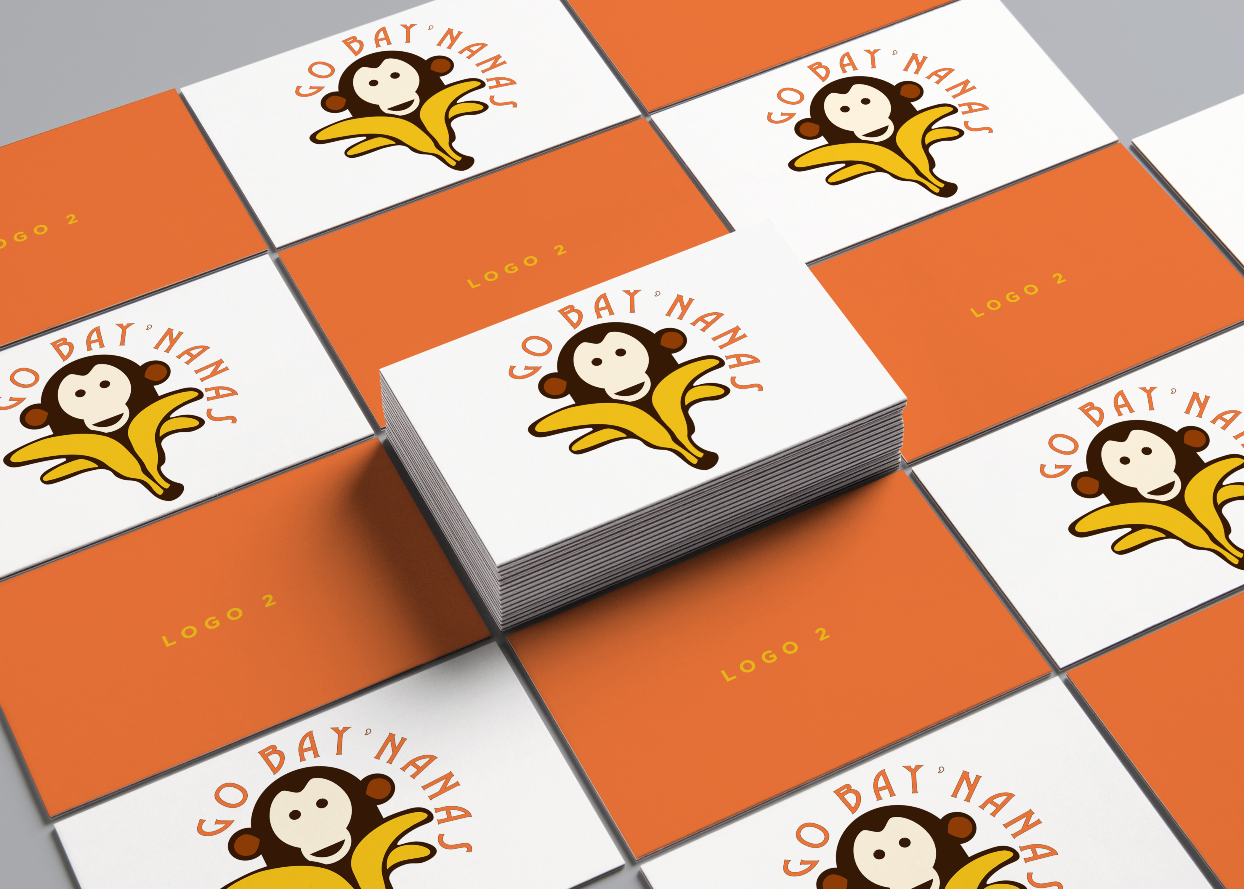
She designed a logo that captured the spirit of the brand — vibrant, approachable, and fun for kids and families. The monkey mascot was chosen to tie into the banana theme, representing playfulness and curiosity. The orange and yellow color palette brought energy and warmth, while the custom typography added a whimsical, handmade feel. Every design element was intentional, aligning with the brand’s mission of making education and dessert fun and accessible.
Website Design Process
to visit click here
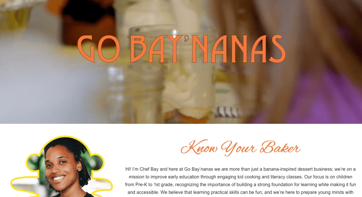
For the website, she took a storytelling approach, ensuring that every visitor would immediately connect with Chef Bay’s vision. She developed a clean, engaging layout that featured bold visuals and interactive elements. The homepage showcased the brand’s offerings and mission while spotlighting Chef Bay with a personal touch in the “Know Your Baker” section. The design prioritized clarity and navigation, making it easy for parents to learn about kid cooking and literacy classes.
Outcome
The result was a cohesive brand identity that blended creativity with purpose. The logo became a symbol of trust and fun, while the website provided a professional and inviting digital home for the business. Through this project, she successfully brought Chef Bay’s vision to life, helping her inspire families and spark a love for learning.
When she designs, every detail has meaning!